If you have problems colouring it s because you still don t have the eye hand coordination necessary to do that.
How to get that coordination? Start inking with the brush. Just black ink. When you get accustomed to that start colouring with watered black ink.
Use cloth to dab exceeding ink and white gouache to cover mistakes.
When you feel comfortable with this process you can start using coloured inks or watercolors.
The process is the same with oil or gouache painting: black then you add some white to create shades and when you feel comfortable with that you add colour.
If you have problems with coloured pencils or pastels start hatching with pen nib or ink pen. Then in other drawings use hatching with soft pencils and smudge graphite with your finger. When you feel comfortable with that you are ready to use coloured pencils.
Markers: colour with ordered stripes and never recolour on areas already coloured unless you want to create shadow effect: recolouring on coloured areas makes the previous color darker and more satured. And fill white gaps of course 😉.
In order to draw dynamic poses, knowing that the head stays in the body 8 times many times is not enough: many times you need faster references to get the job done. Here are some reference sizes that can help you a lot in your task:
Human body is divided in two sizes: head-pubic bone and pubic-bone feet. You can divide further the leg size considering the distance between public bone-knees and knees-feet;
You can fold human body in 3 sizes: feet-knee, knee-hips, hips-armpit;
The Vitruvian man drawing of Leonardo shows that the arms wide open are the same length of a man s height;
The elbow reaches right over the head;
A bent arm size with a closed fist is the same length from shoulder to elbow and to elbow to fist;
Legs in side view are s-shaped but more important they are revers-b-shaped on front view and it helps a lot while foreshortening;
Limbs describe arcs of circles. This concept is really important when you use foreshortening;
The width of shoulders is 3x head (and the head, of course, stays in the middle) . This size increases if you are drawing superheroes.
Check the images below to have a glance of all the forementioned references.
Tricks to draw human in motion. Drawing human body is always difficult. But there are some tricks that can make way easier your task. First let s stress on basics again :
Boxes: as always overlapping of boxes gives the idea of forward push;
Forward push: a still human figure is like a vertical rod. If you want to give the idea of motion you have to show the rod falling forward , using overlapping of basic boxes and in case also a bit of perspective;
References: check out the article of human body size references (click here) ;
Copying photos of motion: we have already talked about that on the article about how to copy a photo (click here)
Use of 3D models of course , like 3d mannequin, can fasten your process.
After the basics you can use more advanced tricks:
Rails trick ( the best one ) : if you have problems drawing something on the front view , try to draw that on side view and after on the front view again with parallel lines joining the main points of side and front view together at the same height . Imagine a statue or a plastic model of a running character that you can watch on the side and on the front view.
Preceding poses: If you have problems drawing a character pose in motion draw the preceding moves so that you have an idea of how it got to the point where it is.
Silhouette: the contour of a character dynamic pose is the same if you check it front view or back view. Hence if you have problems drawing it on one side try to draw it on the opposite site first.
Best art book about dynamic poses: ” Dynamic anatomy” by Burne Hogarth . I think this book is unique in it’s genre so read it. Checkout in your language translation as well.
Often artists say that hands are difficult. And they are. Yet in my opinion eyes are no less difficult and way more important than hands. You can replicate somehow a hand and, unless you are impaired, onlooker immediately understands that you drew a hand. Eyes instead express the personality and the emotions of a character and they are the first thing you notice when watching it, even in real life with people.
There are 4 main errors when drawing eyes:
Not enough distance between eyes. There should be enough room for a 3rd eye in the middle of the two. Some artists add an extra distance but as a rule of thumb remember: between the two eyes there should be enough space for s 3rd eye.
Eyes not on the same line: So line them up !
Iris entirely visibles: because of eyelids ,unless you are not going to show particular emotions, ( but in that case it should be considered all the facial expression ) you can only seen ¾ if not ½ of the iris.
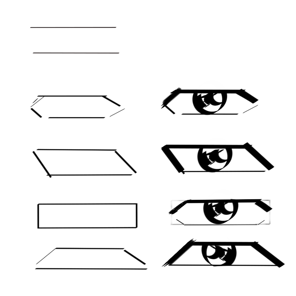
Eyes almond shaped: the worst of all. Eyers are not almond shaped. They have a more complex form . They look like an almond but they are not. The correct way to represent eyes is: geometrically.There are many methods to draw them:
parallelogram;
elongated hexagon;
elongated rectangle ( that you change later in an elongated hexagon rounding the borders);
isósceles trapezoid;
And with the upper eyelid thicker to represent faster the eyelids.
Another trick is to mark only lower and upper eyelid with two lines and only after build up the borders.
Some artists just suggest the lower eyelid and lower iris ( Jim Lee to say one)
Manga artists exaggerate eyes reflections getting so much expression in their characters.
If you want to learn to draw eyes check Tsukasa Hojo and Takehiko Inoue : they are two awesome masters on the issue.
You always have to remember that no matter how main there are in your scene there always are two main basic objects:
subject;
background.
To get a good picture, wether if photo or drawing, digital or hand-made, you always have to separate these two.
You can achieve this in 2 ways:
tonal values: tone is the amount of light your colours have on the scene. If you make a white subject on a dark background it stands out as it goes for the other way around. Add a a grey plane to the equation in the middle and you have a scene with 3 planes of depth . With 2 or even 3 shades of grey you can have a variety of levels of depths in your scene. When inking grey of course is rendered through hatching more or less thicker.
coloring: satured colours for subject and cold greyer or watered down colors for background. In addition to these: hot colors for subject and cold colors for background or the other day around.
Consider also the atmospheric perspective effect where you see far objects color watered down and bluish because of atmospheric dust in the middle .
This effect can be also reproduced for near subjects with different planes of depth to highlight this plane difference and recreating a kind of light bokeh effect.
When copying a photo most of the times your notions of anatomy are messed up . Therefore you need another way to reproduce your image. Let’ s follow this one, deriving from the copy of real-life model in Fine Arts Academy
First you find the center of the action:
Then you divide the image in quarters to understand what the position of every element is in the image:
After this you start tracing vertical and horizontal lines to see what is in line with what. Don t use diagonal lines for now because human brain sees first what is tilted and anomalous and using only horizontal and vertical lines you immediately notice that you see what is in line with what with these reference lines ?
After this you do the same but this time really with diagonal lines, noticing again what is in line with what:
And you do that again with curved lines to see the action in your image:
After this you start to identify basic shapes here and there (circles, rectangles and so on ):
You take a particular distance as your unity if measure ( in the image it is… ) and you start to measure every element of the image according to this unity of measure to understand where the element of your image stay in the frame.
You start to identify negative spaces and try to replicate on your image:
With this procedure you are way simplified when copying an image. Try it out !
The first thing to do in order to draw animals in motion is to learn 3 basic poses, let’ s say : spread , tuck and half way
After that, you have to watch carefully the stunt called “kong vault” executed by some parkour experts
Below you can see all the breakdown steps composing the stunt:
From this you see all the basic movements that compose quadrupeds running made by a human:
preparation;
jump;
spread;
tuck;
forward push of anterior legs (arms);
landing;
moving forward ;
Imagine a human doing 2 of these stunts in a row in front of two obstacles and you have a general idea of how quadrupeds run.
Remember: quadrupeds legs move in alternate way; you’ll never see a horse running with two legs forward and two backward unless is leaping over an obstacle
Your Portfolio has to be composed by illustrations , character designs, comics and storyboards.
You don’t need to show loads of pages: Just create some 3 pages storyboards or 3 pages comic to show you have a deep knowledge of the mechanisms behind action, camera shots and page layout.
Don’t show copied material and don’t show things like your super realistic portrait of Orlando Bloom or Jessica Alba ; employers want to see images put in a CONTEXT , moving in a CONTEXT and made up by you not somebody else.
If you make 3 storyboards, 3 comics and 2-3 character designs and 4-5 illustrations ( with some of them coloured , especially digitally ) your portfolio is covered enough.
First try to sketch some basic shapes on orthogonal views: front , side, top and back view. Don t start immediately on ¾ view.
It can be really useful at first to sketch the basic shapes with some grey markers. In this phase of the process don t care too much about perspective.
Ink the basic shapes in phase 1 fixing sizes
Now try to draw your vehicle in ¾ view with hysometric representation using basic shapes like boxes , cylinders and so on and above all: using perspective .
After you mixed all the basic shapes together try to blend them and bevel their shapes according to your needs.
Use photo reference of real mechinery to create realistic models and add them to your previous sketches
Tracing 3D models can be really useful to not loose the general proportions of your model.
TIP: Keeping perspective and construction lines visible adds a sketchy more artistic look to your drawings.
Colour orthogonal and ¾ view or other ¾ extra views you made rendering the metal parts using reflection and shading . You can use markers , watercolors, digital 2 programs, whatever you like.
Inks can be weighted or even. Even extra think inks are used generally for animation because it s difficult to replicate weighted lines for many drawings and because weight is reproduced by color.
As a rule of thumb parts in light are inked with thinner lines and parts in shade with thicker lines. In addition to this stronger parts are inked with thick lines ( muscles of the incredible Hulk to say one or a tiger leg) and softer lighter parts with thin lines ( a satin dress or the traits of a feminine face from example ). Contours of characters are made with thicker lines instead inner details with thinner lines. Same goes for near subjects inked with thicker lines than the background subjects inked with thinner lines.
Good inkers highlight details managing the change between thicker and thinner lines. This goes for example for inner details of a subject where thinner lines could stand out among many thicker lines and also the other way around ( breaking the rule above you could do thicker details among thinner lines of contour).
No contour at all in the middle of a line suggest ultra thinner lines , especially when inking with brush but use these white spot carefully because as a rule of thumb inking works as colouring: you remember when your teacher told you to fill white spots when colouring your drawings ?
Inks are like and edge of a knife: if they are interrupted, jagged , rusty with rounded points they don t cut . Else if the edge is smooth and it flows constantly without interruptions and the point is sharp the knife cuts even iron !
The best way to make inks sharp is sharpening with white gouache pen , with extra little point marker ,with ballpoint pen and with little pointed ball point pen , which conveys more sensitivity to your hand and it can shade better little details of course digital inking is an extra useful tool.
The littler in detail you can go the crispier your inks look.